Branding Case Study
SUBI
A Sea of Fun, Vibrant Ideas
Making waves with a refreshed new identity
Proudly Malaysian made, Subi has been delivering high-quality, affordable frozen seafood for over 15 years, making seafood consumption enjoyable for all. After operating under the same identity for almost two decades, the brand was ready for a fresh perspective to keep up with evolving market demands.
A complete 180 from its original form, we took Subi to new depths of creativity, creating an impactful brand identity that stands out in the frozen seafood landscape. Our refresh began with a bold vision: infusing vibrancy into a traditionally conventional category. While most frozen seafood brands opt for safe designs, we challenged the status quo with a bold and playful approach that captures attention and sparks joy.
SCOPE OF WORK
Brand Strategy
Brand Identity
Brand Development
Brand Consultancy
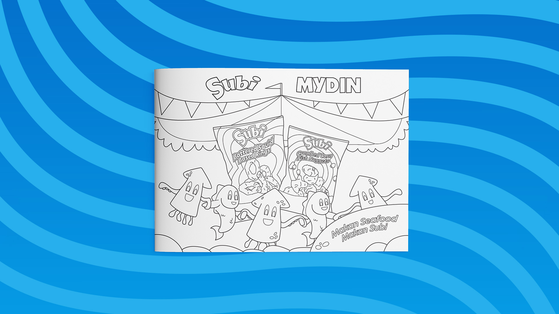
Brand Activation Campaign
Product Packaging Design
Product Photography
Website Design
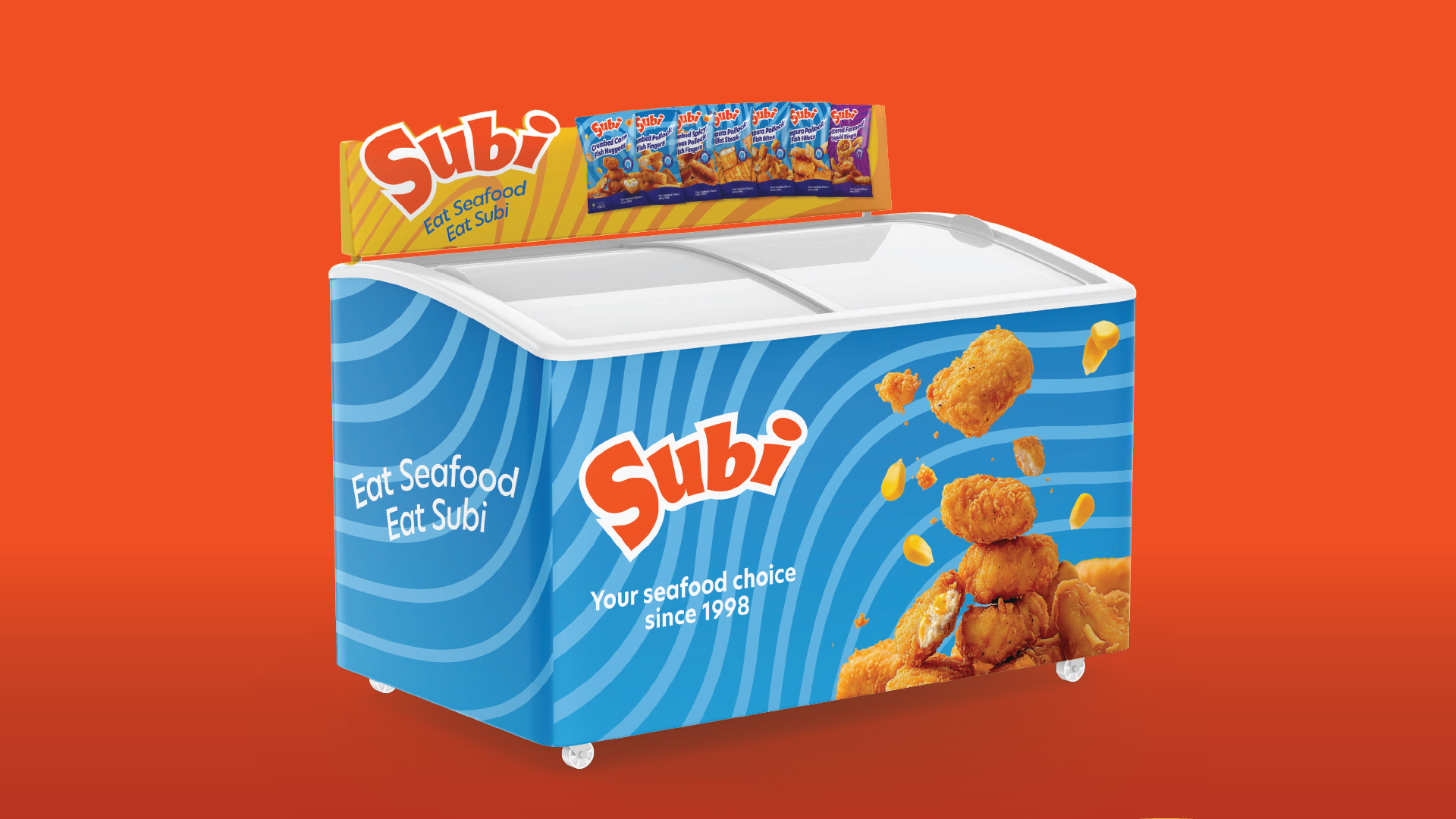
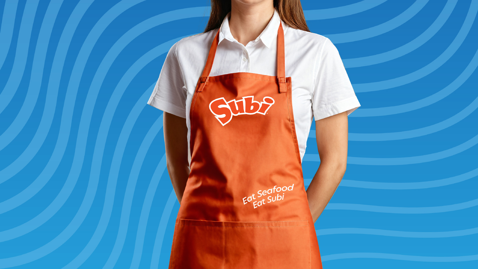
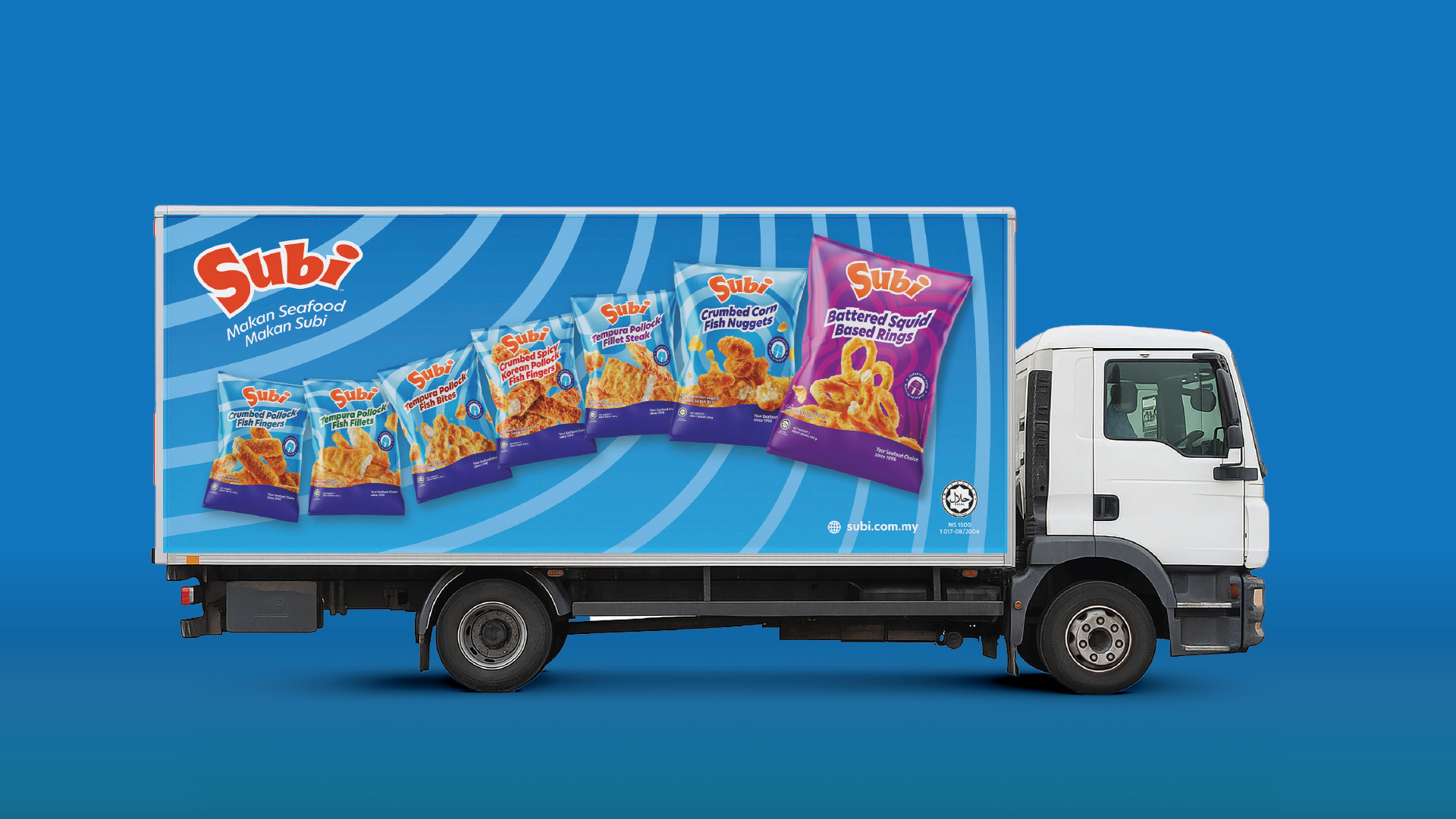
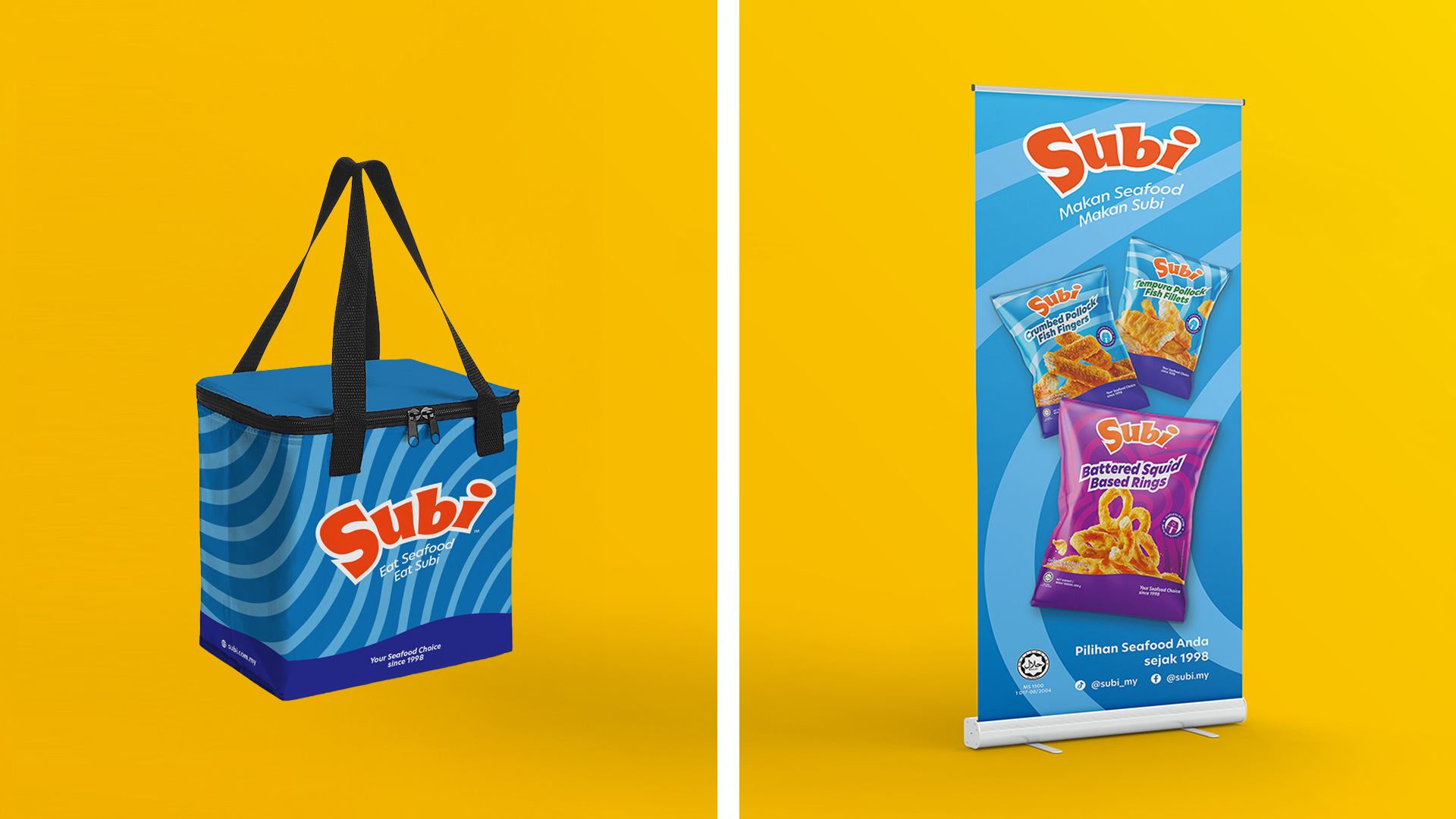
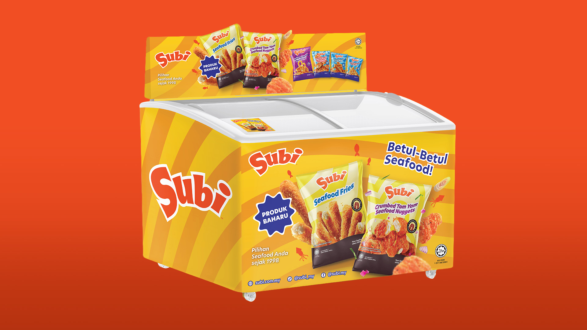
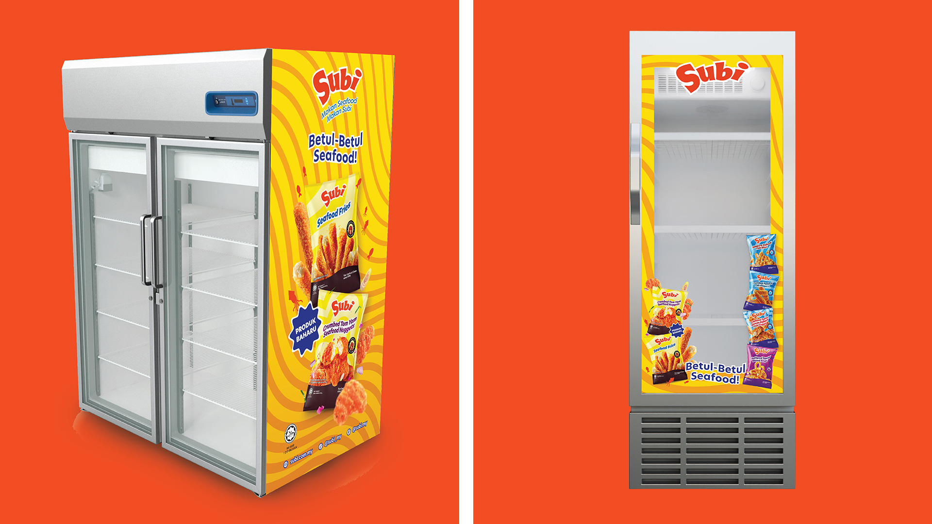
POSM
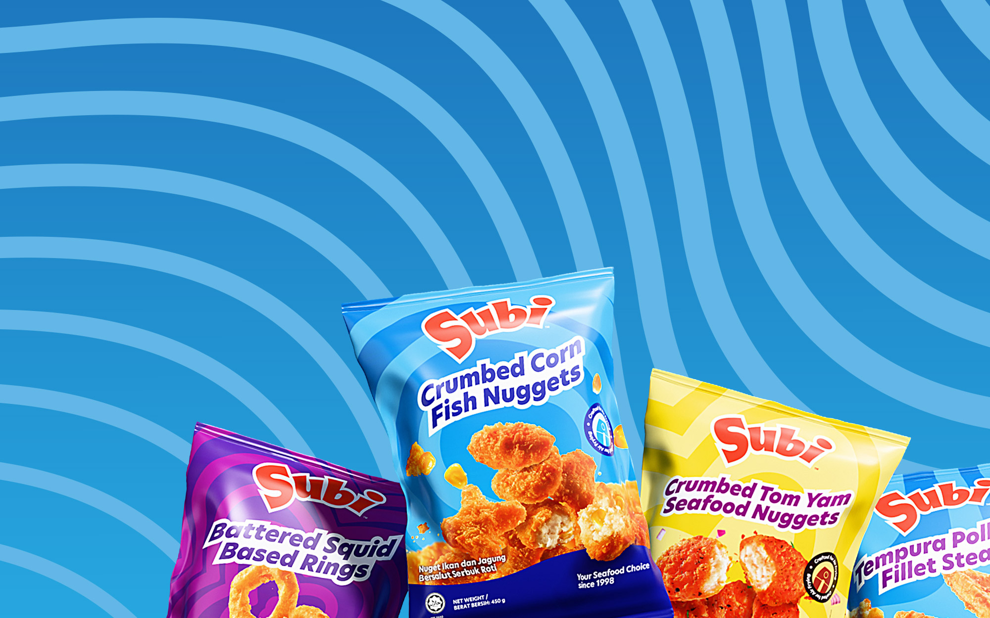
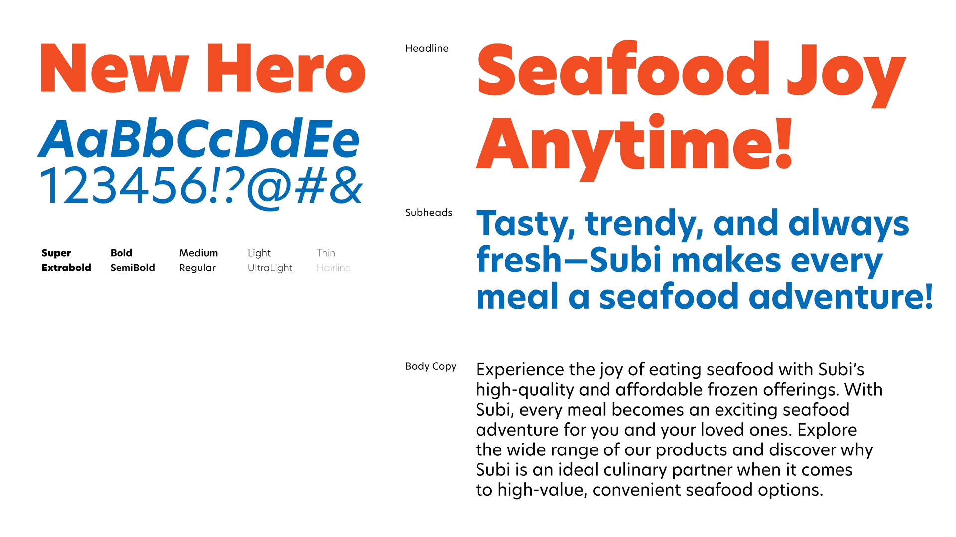
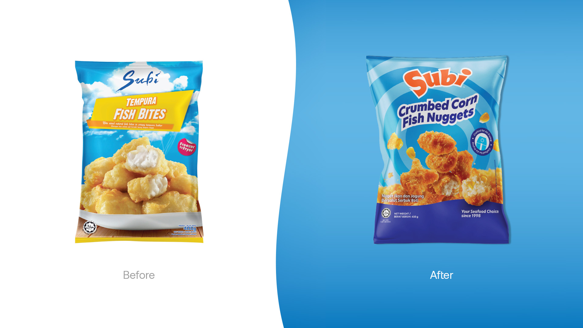
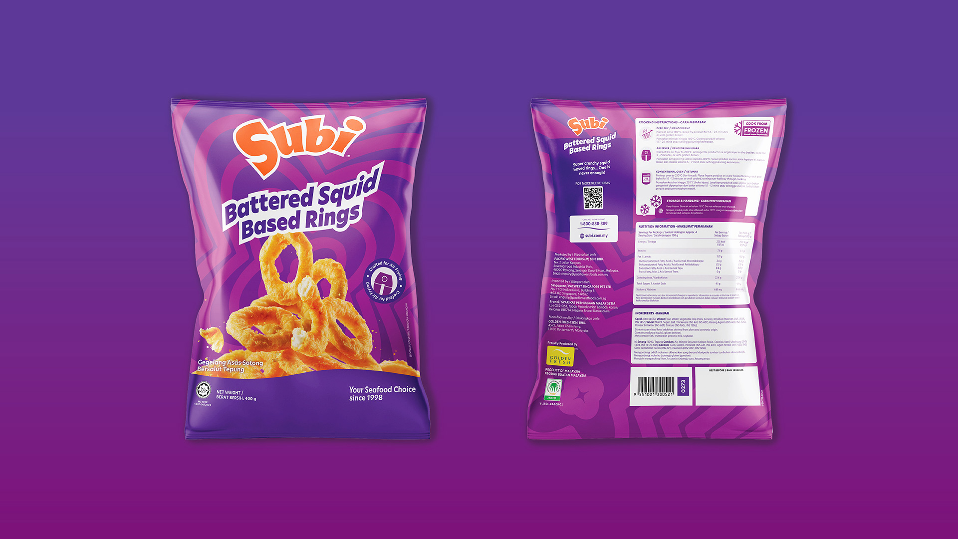
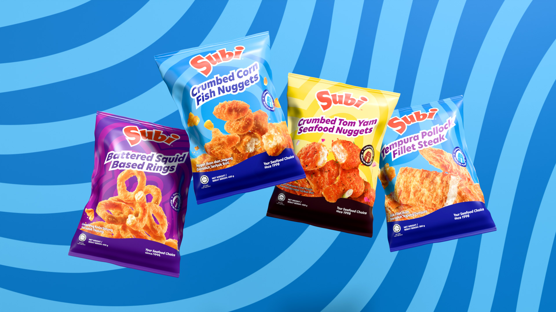
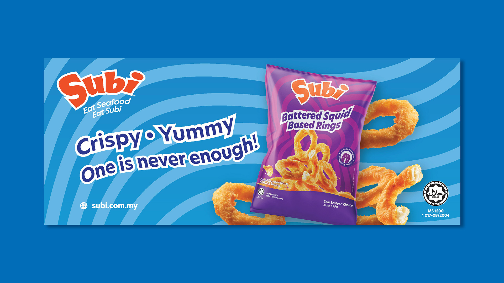
The new identity features a whimsical, custom typeface that embodies Subi’s mission to redefine seafood consumption. Paired with a warm, vibrant orange-red primary colour, the design radiates energy and appetite appeal.
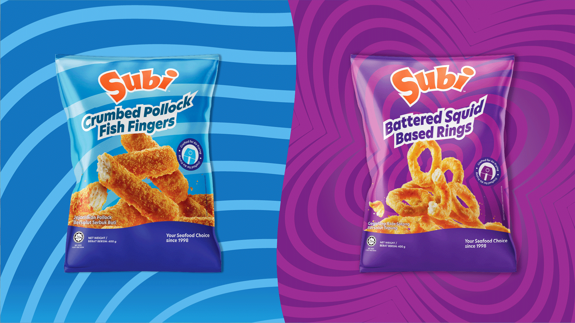
The colour strategy works on two levels: a vibrant primary palette that demands attention through the logo and key brand elements, and a practical secondary palette developed specifically for product packaging. This combination ensures the brand remains eye-catching while delivering clear product information.
We then developed a special pattern system inspired by the sensory experiences of enjoying Subi products. These patterns serve as versatile design elements that add character and consistency across all brand touchpoints while reinforcing brand recognition. Designed to evolve, the pattern system allows future updates and additions that maintain brand freshness.
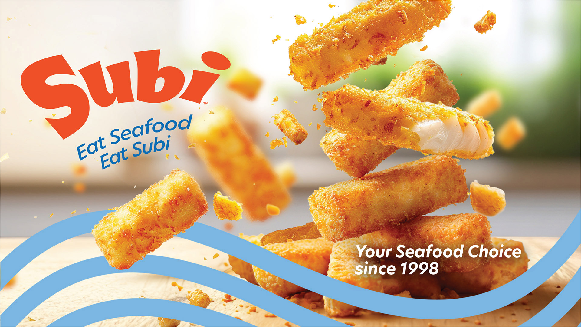
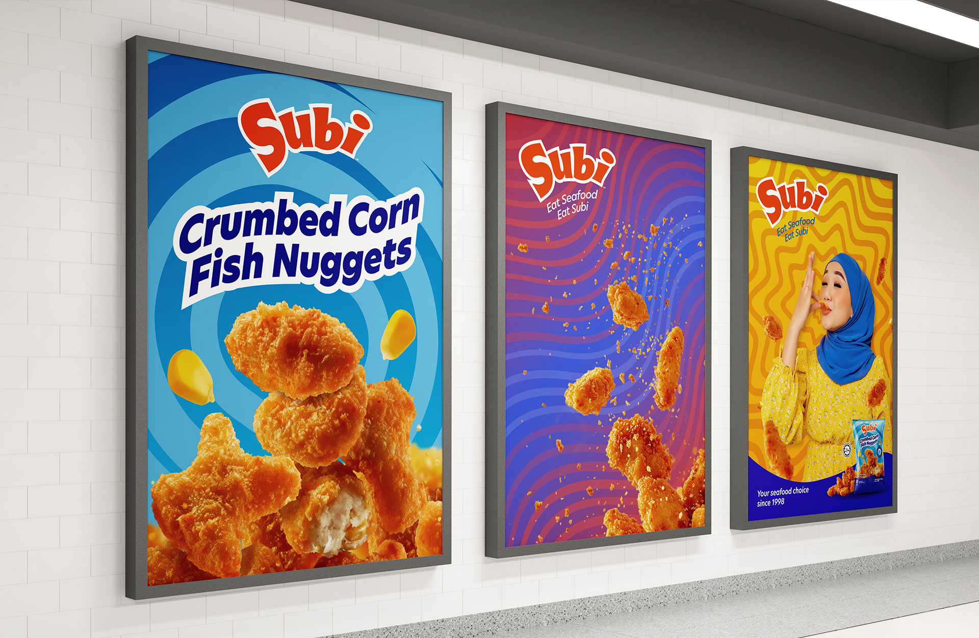
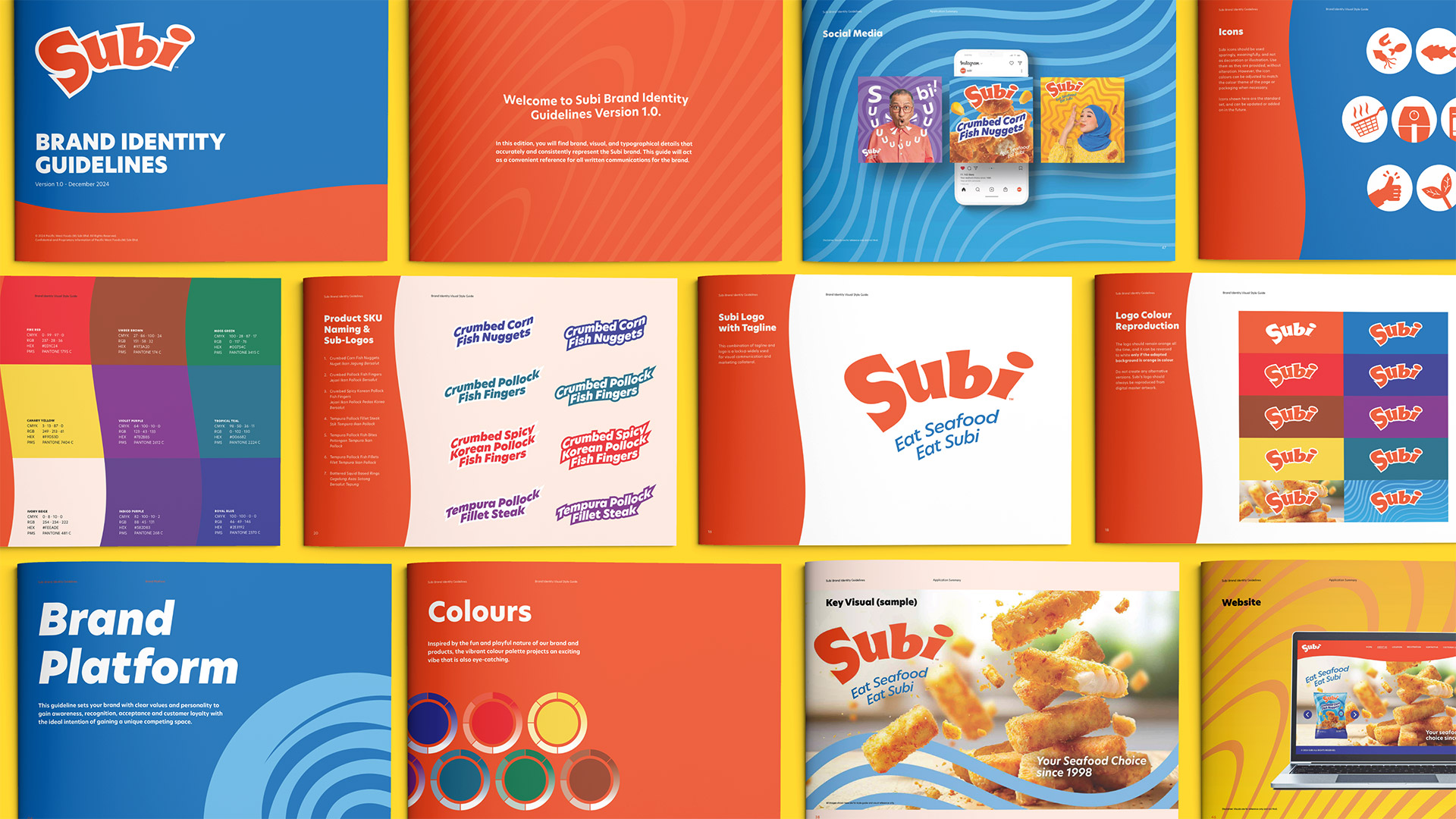
The new packaging design stood as a bold departure from category norms in the local frozen food market. Each product features clear, appetite-appealing imagery upfront, with distinct colours assigned to different SKUs for easy identification. The use of our custom patterns creates visually striking packaging that stands out on shelves while maintaining product clarity and information hierarchy.
Not only that, Subi’s brand experience extended seamlessly to the digital realm through a bright, interactive website design. Incorporating the brand’s signature colours and patterns, the site offers a smooth user experience that is both engaging and informative. The playful interface makes it easy for customers to explore Subi’s product range while reinforcing the brand’s commitment to accessibility and quality.
The refresh resulted in a cohesive identity that makes Subi’s high-quality, flavourful products accessible and appealing to all consumers. The colourful, fun packaging stands out on shelves while communicating affordability and value, successfully positioning Subi as a modern, engaging brand in the frozen seafood category.
W3RK Team
Client: Golden Fresh Sdn. Bhd.
Strategy Director: Daniel Joseph
Creative Director: Tang Chen Hooi
Creative Producer: Janet Chan
Writer: Zoe Tan
3D & Motion Designer: Chua Eng Lam
Graphic Designer: Kok Yip Wing, Por Qi Yan, Liew Huan Yi, Jeremy Kan, Sorfina Yung